
Turn dormant data into decisions.
GPS, wellness reports, medical records — we analyse what your club already holds and build models and findings specific to your squad. From deciding which indicators to collect, through organising the data, to putting it in front of staff, we can take on the whole of it.
Example 1 — Injury risk prediction
Combining GPS, wellness, schedule and injury history, the model reads the overlap of factors that each look normal on their own, and flags risk player by player.
Inputfour kinds of data
- Self-reported wellness (fatigue, sleep, soreness)
- GPS and training load
- Schedule (fixtures and congested runs)
- Injury history and medical records
Model
learn how the factors interact
One outcome — injury — predicted from many sides. Built on your club’s own data and updated continuously.
Outputwhat you get
- A risk score (daily and weekly)
- The factors driving that risk
- Suggested actions — load adjustments and what to check
| Metric | ConventionalACWR (single indicator) | Odonata |
|---|---|---|
| Precision Of the days flagged as risky, the share on which an injury occurred | ~5% | ~70% |
| Recall Of the injuries that occurred, the share flagged in advance | ~20% | ~20% |
Precision goes from ~5% (ACWR) to ~70% (Odonata), while recall stays at ~20% for both. Not every injury is caught.
The conventional method monitors a single load ratio (acute:chronic workload ratio, ACWR).
This does not guarantee that injuries are prevented. It is there to support the decision.
Limited to muscular, non-contact ligament and overuse injuries. Contact injuries such as fractures are out of scope.
Validated on University of Tsukuba Football Club data from 2022–2025. Results will differ with the club and the data available.
Example 2 — Network analysis
Combining wellness, GPS and match statistics, we map which indicator affects which, and how, as a diagram.
We map the indicators as a web of connections, so you can read the whole of a player as a system — something no single metric shows.
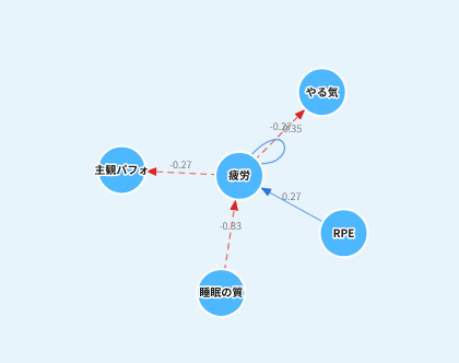
Reading how yesterday affects today
Here, a drop in sleep quality sharply raises fatigue the next day (−0.83). Session intensity (RPE) pushes next-day fatigue up as well.
“I am the type who carries fatigue over when sleep slips.” Start with the evening routine.
In congested runs, protect sleep first. The morning check-in lets you adjust the day’s load in advance.
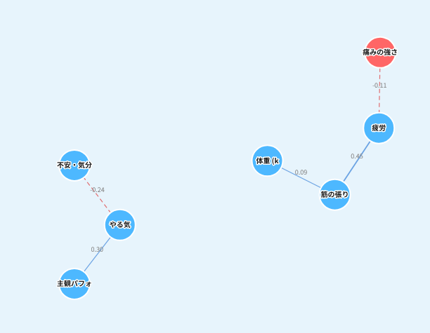
Reading which indicators move together
Here, fatigue and muscle tightness move together on the same day (0.45), and a dip in mood and a rise in anxiety lower motivation (−0.24).
A tight day is a fatigue signal — a cue for self-care and for telling staff.
For players whose mood carries into performance, a conversation comes first.
The diagrams are examples from a demo environment. The structure that emerges differs by player and by club.
Example 3 — Wellness × match statistics
We quantify where accumulated load and fatigue show up in what a player does in a match.
Separating the players who drop from those who do not
In weeks where load and fatigue overlap, duel win rate falls by ~16 percentage points on average. The size of that drop varies widely between players, so we estimate it per player rather than as a squad average.
It informs both selection and load planning: who to use, in which week, and how much.
Estimated with a hierarchical Bayesian model on roughly 56,000 player-days of GPS data plus daily wellness records from University of Tsukuba Football Club. Results will differ with the club and the data available.
How we work
There are two ways in. From either, this can grow from a single piece of analysis into ongoing work.
Route 1 — Start from analysing your existing data
We take what you have and return it as an analysis report. You can see what your data is worth before deciding anything else.
Route 2 — Start from the platform
Set up how records are kept first, then layer analysis and prediction onto what accumulates.
Initial conversation
We listen to what your staff need and choose the approach. Online is fine.
Organising and collecting data
From tidying scattered records to designing and collecting what is missing.
Analysis
Analysis built on the complex systems approach, then talked through in your staff’s own terms.
Implementation
Into daily decisions, through support, models in the app, and the platform itself.
Steps 1 to 4 — we can take on the whole of it
Cost
We agree the cost with you once we understand your goals and how you want to work.
Tell us what data you already have.
“Is this data any use?” is a perfectly good place to start. We reply within two working days.